


UX Designer | Summer 2020
To comply with my non-disclosure agreement, I have changed some of the quantitative data and omitted some information in this case study. All information in this case study is my own and does not necessarily reflect the views of Electronic Arts.
UX Design
User Testing
Design Systems
Me
1 Senior Experience Design Manager
2 Product Managers
UX Design Intern working with my manager, a Senior Experience Design Manager
My goal of this project was to improve the player’s experience on EA Help to enable them to find help faster. The number of support tickets will be reduced leading to more time saved for the company.


Enable the players to find help by themselves to reduce the number of support tickets. By providing an intuitive and easy for for players to get help, it ultimately saves the company more time.


I conducted a competitive analysis of the help sites of other large game companies. Many players of EA games also play the games from other large game companies.
Understanding common ways other game sites enable players to find help gave me an understanding of common flows. This helped me define which solutions to include in my design.
After examining various game help sites, I realized Electronic Arts was missing:
The wireframes introduced a new user flow inspired by common patterns found in market research. It includes:

The games are displayed upfront so the player can quickly find their game to meet the user needs. The promotional content is displayed to meet business goals. In the first iteration, more games are displayed, hiding more promotional content.
The pros and cons are also evaluated from user testing on the high fidelity prototypes.

Players will land on this page after clicking on a game tile from the home page. The page layout stays consistent with all game titles.

I followed Electronic Art’s existing visual design style guide to make the first high-fidelity mockups. I've also added new features such as "Contact Us" and a layer of personalization (sort by categories)
Overall, this addresses the pain point of having understanding the sequence of actions. Players can see and personalize the games and navigate to their help problem in this design.
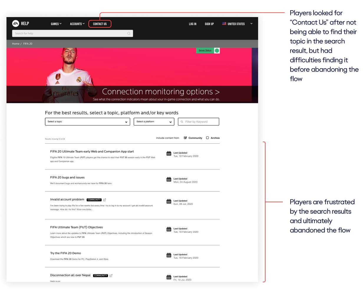
The navigation menu features a more discoverable way to contact support.
Enable players to find help with their game on their own.
Reduces the number of support tickets sent → Saves company more time
Marvel App
24
Task Completion Rate
Satisfaction Rate
Qualitative Feedback
After user testing, I created iterations of the home page. Differences between the authenticated (logged in) and unauthenticated pages are designed to cover multiple touch points.
In order to differentiate between owned games and non-owned games, I also explored different ways of show games that are owned. This is shown when the player is logged in.


The redesigned homepage makes finding help easier. The search bar, account management, and help with a game are all easier to find.
The redesigned product page helped players find where specifically to resolve issues easier. As account management issues are the most common, they are also displayed on this page. The top topics are also organized by category.
Coming up next, I plan to run another usability test to measure task completion rate. The goal is to enable players to find the help they need on their own. By increasing the task completion rate, the number of support tickets is reduced. This ultimately saves the company more time.
2022 Update: I'm still designing at EA, but working on different products now, centered around marketing. EA Help is currently being worked on by another team.


